

Designed to Be Used
Hims & Hers CDO Dan Kenger on designing brands people actually use

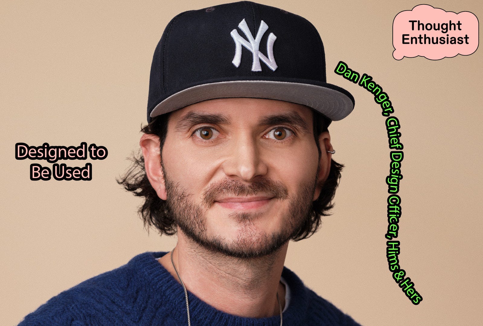
This week Dan stops by to talk about what makes design actually work, from Super Bowl ads to green apple gummies.
Dan Kenger is a seasoned design leader, renowned for shaping the creative direction of brands and crafting impactful consumer experiences. In his current role as Chief Design Officer, Kenger spearheads design at Hims & Hers, guiding the creative team responsible for every customer interaction from physical packaging to the seamless digital experience on websites and mobile apps. Kenger ensures a cohesive and innovative approach to brand engagement.
Before joining Hims & Hers, Kenger served as the Vice President of Creative at Pattern Brands, where he directed the creative strategy for a portfolio of brands, including Open Spaces. His leadership at Pattern evolved from his decade-long tenure as a partner at Gin Lane, an agency recognized for its transformative work with direct-to-consumer businesses.
Throughout his career, Kenger has defined the aesthetic of the direct-to-consumer category, drawing inspiration from his curiosity and passion for creating designs that resonate across generations. His work continues to influence the way brands connect with modern consumers, blending creativity and purpose to leave a lasting impression.
Thought Enthusiast is an editorial project from AdHoc, a New York experiential agency exploring the people, ideas, and cultural currents shaping what’s next.
The Patient Experience
Healthcare treats design as decoration instead of infrastructure. From what I see, most of the industry focuses on the technical provision of care, treating everything else as an afterthought. The packaging, the waiting room, the portal you have to log into just to see results—all of it gets treated like window dressing tacked on once the real work is done. Walk into almost any healthcare experience and you can feel that hierarchy: the medicine has years of necessary rigor, but too often, the consideration for patient experience stops there. That gap is exactly where people can fall off, whether it’s a form nobody fills out correctly, medical results people can’t understand, or a treatment plan nobody sticks with because the whole experience feels like a chore.
The uncomfortable truth is that the best medicine in the world does nothing if people don’t actually engage with and take it, and engagement is a design problem as much as a clinical one. Every other industry figured this out years ago, banking, retail, travel, they all treat the experience as the product experience, not something bolted on afterward. Healthcare is finally catching up, but there’s still this instinct to treat design as polish rather than a lever that changes outcomes. Until that shifts industry-wide, healthcare is going to keep leaving real results on the table, not because the science wasn’t good enough, but because nobody made it easy, or worth showing up for.
You Can’t Outsource the Soul of a Brand
I’ve believed the same thing since my agency days at Gin Lane: you can’t outsource the soul of a brand. Tactics change constantly, platforms change, what’s trending on TikTok this week will be dead in a month, but the thing that actually builds trust with people is consistency of voice and care, and that only comes from people who deeply understand what the brand is trying to say and why. The moment you hand that off to a rotating cast of vendors, you get something that looks fine but feels like nothing.
That’s part of why we build so much of our creative in-house at Hims & Hers. When you’re telling stories that are vulnerable, stigmatized, or medically nuanced, and healthcare can be all three, you need people in the room who understand the weight of that, not just a brief that got handed off. That means it can be slower and harder to scale, but it’s the only way I’ve found to keep a brand’s soul intact as it grows.
Why Intentionality Matters
Attractive brands look good scrolling past you. Culturally influential brands make you stop, because they say something to you that strikes a chord or you feel deep in your bones. This year when we took Hims & Hers to the Super Bowl to spotlight the health-wealth gap, the bet wasn’t that people would find the ad beautiful, it was that they’d recognize themselves in it. We watched the conversation shift in real time, from “what are they selling” to “this is about equity.” That’s the difference. Attractive gets admired, influential gets absorbed.
Cultural influence also requires follow-through, which is where a lot of good campaigns fall apart. It’s not enough to make a big cultural statement once a year and hope it sticks. We carry that same message across the way we approach social content, into the packaging and design of a treatment, into how the UX of a lab result actually appears to a customer. If the big cultural moment isn’t backed up by a hundred smaller, intentional design decisions, people notice, and the brand just becomes another company that ran a nice ad.
Restraint Creates Honesty
You have to treat every touchpoint like it has a specific job, rather than trying to make everything sound the same. An ad can push harder and be more provocative because its job is to get attention. A product experience has to be clear without being condescending because its job is to help someone make a decision about their body. Minimalism helps here, not because less is trendy, but because restraint reads as confidence, and stripping away everything that isn’t doing real work forces whatever’s left to be honest. That’s also why at Hims & Hers we insist on real people over stock photography or polished models. Healthcare is full of stigmatized, vulnerable, medically nuanced stories, and tone only lands if the person on the other side of it actually feels like someone you’d trust with something real.
The other piece is obsessive testing, even on the smallest details. The green apple flavor on our hair gummy went through round after round of testing before we landed on it, tart and bright enough to enjoy, but not so intense it felt like candy first thing in the morning. That’s a tonal decision as much as a flavor one. Getting a brand’s tone right isn’t about picking the right adjectives in a brand deck, it’s about testing whether the actual experience feels the way you intend it to, in the moments that matter.
Working for a Five-Year-Old’s Attention Span
Honestly, I get more inspiration from my own house than from healthcare. I’ll watch my wife go through her nightly skincare routine and pay attention to what she actually reaches for versus what sits untouched on the shelf, because that tells you more about good design than any trend report ever could. Half the thinking behind the hair gummy’s jar came from paying attention to how skincare brands make a $12 product feel like a $50 one, and honestly, most of that education happened on my own bathroom counter.
Being a parent has changed how I design, too, mostly because kids have zero patience for anything that isn’t immediately obvious or genuinely fun. If something doesn’t work for a five-year-old’s attention span, it’s probably too complicated, and that’s a surprisingly useful filter to run everything else through. I also intentionally give myself over-the-top constraints, like designing something as if it had to fit in someone’s pocket, or as if I could never use the color blue. Constraints force you out of the default answer, which is usually the least interesting one. And sometimes it’s as simple as putting on the right playlist after the kids are asleep and sitting with a bad first draft longer than feels comfortable, because the second and third drafts are almost always where the actual idea shows up.

AdHoc’s campaigns live in the spirit of creating experiences with an emphasis on the unconventional, unfounded, and new to build things that feel culturally embedded and considered rather than overbranded and boring.